One of the most exciting tasks I was given in Surf's Up was to design the surfboards (all except for one, the ice board which was designed by my good friend Marcelo Vignali). Here's my first installment showing designs for the Shrine, Geek/Big Z, Cody, Lani, Chicken Joe and the generic competition (Reggie's) boards. All my board designs are completely done digitally in color with suggested textures using photoshop on top of backgrounds painted by Paul Lasaine, Joty Lam and Noelle Triaureau and characters by Sylvain DeBoissy. All images ©Sony Pictures Animation.
Above: What's left of the surfboard from Big Z's "accident" were put together and turned it into a shrine. Below: My concept for the Big Z board that was used in the film was it's a part of him being "one" with the board. So I used the same flower pattern on his body for the design on his board and it worked.
These next concept designs for Big Z's old boards are based from long boards and patterns used in the 30's-40's. Somehow, long boards for me, signifies age, experience and stability which are what Big Z was all about.
Cody's board has to be plain and simple to stand out and since he built it from scratch with Big Z from a log.
For the earlier concept designs, I used the pointed short board for Cody to show his restless personality and speed.
You'll notice that for Lani, I used a pattern from one of Big Z's shrine concept boards above which has the typical Polynesian "Lilo & Stitch" feel. She uses a medium board which for me signifies a combination of both speed and stability.
The first concept I had for Chicken Joe's "cornboard" was an actual sliced corn cobb that he uses as surfboard. Can you see the "hidden" liger underneath paying homage to his previous Napoleon Dynamite character.
Then for the one used in the film, I figured that since Chicken Joe lives in the backwoods, their surfboard design never changed through the years so the shape of his board was patterned from the old longboards with flat tips circa 1920's. Notice the hammer marks and nails sticking out on the deck.
Reggie is a very flashy, flamboyant promoter so the surfboards he issues to surfers have to reflect his personality. That's why they're painted with bright colors (has the plastic feel like Reggie's character) and has his logo (which is his face) on each one (for he's full of himself). Again short board is my choice to show speed and competition.
More surfboards to come and HAVE A WONDERFUL CHRISTMAS TO YOU ALL...
VISUAL DEVELOPMENT • PRODUCTION DESIGN • LECTURER • Animated Films, Games & Commercial • www.facebook.com/armandserrano.artist • Twitter - @ArmandSerrano
Monday, December 17, 2007
Wednesday, November 21, 2007
An ArtRage Piece
©Armand Serrano.
A few months ago, I posted my very first ArtRage piece, Well, I havent touched the software since till a couple of nights ago. I was talking to another artist in the studio how tedious and slow Painter software is. Well I got reminded of Artrage and decided to play around with it again. After a couple of hours of enjoyment, I'm so satisfied with the simplicity and ease of use versus the very complex Painter. The textures are working out fine and not to mention that it doesn't lag down even when I'm using a big brush. It has no fancy saturation, color balance, even brightness and contrast controls so it trains me to be sharp in choosing my values and colors. I'll be definitely using it more in combination with Photoshop for the new project I'll be art directing at the studio. It has my endorsement if you guys want to check it out. By the way, did I say it's only $25 bucks! This is the piece I did that night - I'd say 99% Artrage and 1% Photoshop (just for a slight tonal gradation).
Wednesday, November 07, 2007
More Tonal Sketches for Mulan
Wednesday, October 24, 2007
Canyon Country Fires
You all have seen on the news the fires here in Southern California. I live in Canyon Country and had a first hand experienceof some of the scary moments during this buckweed incident that started rapidly Sunday afternoon. We were not evacuated but had to stand by just in case. The first five photos were taken from my backyard Sunday night. We're looking at the Whites, Plum and Sand Canyons which are approximately only 3-4 miles away from where I live. Last two were taken yesterday. That's Saugus area near Castaic. Fortunately, it's quiet now on our front but let us all continue to hope and pray for many whose lives and properties are directly affected by this calamity.
Monday, October 08, 2007
Locals Luau/Surf's Up DVD and Blue Ray out!
©Sony Pictures Animation.
It's here! For those of you who haven't seen Surf's Up yet, here's your chance to do so. The Surf's Up DVD and Blue Ray discs are finally out Tuesday, October 9th. In line with the release, here are a couple of artworks from the movie titled "Locals Luau". The first one is the concept art where the luau is happening inland away from the beach. Notice the "Lady and the Tramp" moment between Cody and Lani. But instead of spaghetti, they're eating a squid of course. The local inhabitants of the island are having a luau mixed with dolphin rodeo and a carnival (sort of like the LA County fair penguin style) on the background. The second one is an overview if it's happening by the beach and more commercialized. Unfortunately, this sequence was on till halfway through production then the directors decided to take it out. Anyway, enjoy the movie.
Wednesday, September 12, 2007
Norseman Using ArtRage
Convinced by my friend Simon Rodgers, who's I'm sure having a great vacation as we speak in his hometown in Ireland, I finally purchased ArtRage. I'm impressed by the paint textures, the simplicity and ease of use as compared to Painter (and not to mention the price). This was a half an hour quickpaint cocktailed with a slight Photoshop. Great software.
Saturday, September 08, 2007
"Murmillo" / Marcos Mateu
Finally an artwork as promised. Can't sleep one night so I decided to do something. I saw an old sketch I was planning to paint a long time ago. It was inspired by an old 50's epic film titled "Demetrius and the Gladiators" starring Victor Mature. That film was the sequel to the classic "The Robe", the very first film shot in cinemascope with Richard Burton and Jean Simmons. Both are part of the list of films I love to watch when I was a kid (hey, only re-runs on Holy Week, I'm not that old!) and inspired me to work in the industry. Finally after a long wait, I was able to paint it, not in oil (thank goodness no mess!), but in Photoshop in three and a half hours. The painting depicts a Murmillo (with an Ernest Borgnine physique) entering the arena facing the uncertainty of survival. Love this historical subject when I was a kid.
On another note, my very good friend MARCOS MATEU is moving back to Dreamworks. Last Friday was his last day at Sony and honestly, it hasn't sunk in yet that he won't be at the studio when we go back to work on Monday. It's definitely different for me and my friend Marcelo. Marcos is incomparable and I've never met any other artist with such caliber. Definitely I echo how Marcelo described him in his blog - a virtuoso! Marcos gave this Roman drawing to me during our first few days working together in Surf's Up while jokingly talking about how to do production design in a live action movie. What a priceless learning experience for me working with him. All the best my friend.
Friday, September 07, 2007
Another Proud Daddy Ad Again
Wednesday, August 22, 2007
A "Proud Daddy" Ad Again
We went to the Old Navy shop in Valencia yesterday and were greeted by my youngest daughter's ad on the toddlers' section for sweaters (she's the curly haired one on the left and right). She did a two-day shoot for this two months ago in Culver City and didn't expect for it to come out in stores till fall. Sorry guys but can't help to post another proud daddy ad. Take care you all.
Friday, August 03, 2007
Space Dock
Seldom I draw sci-fi art and I admit I'm very picky and selective about it. I have a few hours of downtime at work so might as well be productive and do a practice. My goal in this piece is to show a design that I haven't seen before but within the boundaries of believability. It's a dock and a town built on what's left of a moon where space sailors could hang out. Anyway, I'm happy on how it turned out and thanks to Marcelo and Simon for their constructive comments. Now go back to work.
Tuesday, July 24, 2007
Comic-Con Surf's Up Book Signing
Tuesday, June 26, 2007
Tropical Jungle Design Part 1 - Surf's Up
©Sony Pictures Animation/Columbia Pictures.
Part of my job in Surf's Up was to design the interior of the jungle. The task was to create a sequence illustration that would visually represent the whole jungle sequence. The middle and bottom images were part of my very early studies for the elements that would populate the jungle. The verticality of the vines appeals to me big time and decided to use them a lot. Also, photos from a hiking trip in the jungles of Palawan back in 1992 in the Philippines came in very handy to remember the experience of how it is inside a dense tropical rainforest. The product is the illustration on top where Geek travels with Cody back to his secret home.
Friday, June 08, 2007
Surf's Up!
Tuesday, May 29, 2007
Surf's Up Book
©Sony Pictures Animation/Columbia Pictures.
If you haven't gotten it yet, head on to Barnes & Nobles or Amazon and
grab Surf's Up - The Art and Making Of A True Story. It has loads of visual development pieces from the earliest concept designs to designing the waves. Here's a sample of my artwork inside - one of the main characters sitting on his ritualistic sandcastle while chanting to call the waves. Done in prismacolor on vellum. Enjoy the book. Below is the original Surf's Up design team doing research atthe Quicksilver surfing competition in San Onofre, California back in summer 2004. (l-r) Sylvain Deboissy, Paul Lasaine, Marcelo Vignali, Armand Serrano, and Ron Lukas.
Make a note on your calendars - movie comes out in the US and Canada on June 8. For worldwide release dates, click here.
Monday, May 21, 2007
Carved Temple
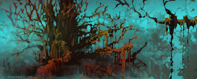
A recent practice piece that actually started as a doodle in Photoshop playing around with the idea of a carved temple inspired by Petra. But instead of being carved from a rock, a temple is carved from a massive tree. Anyway, it's a visdev idea that might come in handy for another project in the future.
Monday, April 16, 2007
Dense Jungle 2
Thursday, April 05, 2007
The Empty Tomb
Easter is here and what a great opportunity to illustrate the origin of this very significant celebration - the empty tomb. This is my depiction of the dawn after the stone was rolled away for all to see that the Savior has risen from the dead. This is a fun one hour Photoshop session and I only used two colors - green and red. As red echoes the death on the cross, green swallows it up with hope and new life.
Happy Easter to all.
Monday, April 02, 2007
SURF'S UP Trailer 2 in HD
Friday, March 30, 2007
SURF'S UP Film Clip
©Columbia Pictures.
By the way, you can view the new second trailer at THIS SITE. Enjoy
Friday, March 23, 2007
Dense Jungle
©2006 Armand Serrano.
I've notice that I've been designing a lot of foliage and organic elements for features in the past six or seven years. As of last month, I'm officially doing visdev on "Cloudy With A Chance Of Meatballs" for Sony which is slated for 2009. And the first production task I have to do is design two environments heavy on foliage. Why am I not surprised! Anyway, so I've been busy lately with work, at the same time doing the final editing for the music video and finishing up the script for my David and Goliath project on the side. So for now, I'm posting another practice piece which I did last year. I love playing around with foreground elements using them to create another "aspect ratio" for my shot. The intention for this practice is to make the elements graphically designed yet dimentional and not to feel like "cut-outs". Lighting plays a big part as always.
Friday, March 02, 2007
Tonal Sketches for Mulan
©Disney.
My little daughter watches Mulan over and over again and everytime I glance at the TV, I still can't help but watch and enjoy it over again myself. It's such a beautiful movie and brought back a lot of memories and artworks in mind. Seeing some shots that I did, I went through my files and dug up these two artworks what we used to call tonal sketches. Whenever we finished a cleanup layout, we used to include also a smaller composite drawing complete with tonal renderings of both bg and animation pose. This represents how we see the complete layout on the screen and the basis for the background painting. These were done in pencil and grey pantone markers on heavy animation paper ten years ago!
Subscribe to:
Posts (Atom)